THANA
ZEYARA
As a Toronto-based graphic designer, I embrace diversity and resist confining myself to a single pursuit. My Arabic background has deeply influenced my signature style, which promotes the fusion of the both Arab and Western worlds to produce modern designs.
GRAphic designer
Echoes of Loss.
As olives symbolize hope, tradition, and heritage, our lives, our children's lives have been brutally interrupted. This projection project displays not just children, but only a drop in a sea of infants' and babies' names that have been killed. The soundtrack is intended to immerse you in the struggle of the Palestinian people, who simply seek to exist.
flamingo Gallery wall
Designing an exhibition wall with the strict theme of dancing flamingos was both intriguing and enjoyable. Leveraging my expertise in Arabic, I chose to use Arabic letters to form the shape or outline of the flamingos. Through careful selection of colors and strategic overlapping of Arabic script, I created a playful and dynamic set of walls for the exhibition.
TRue brew
True Brew is a marketing agency uniquely tailored to coffee shops, infused with a playful and energetic brand identity that mirrors the vibrant atmosphere coffee lovers cherish.I developed a fun and inviting brand identity tailored to the unique world of coffee shop marketing. This project showcases a blend of creativity and strategic design, engaging coffee enthusiasts and attracting them to the unique services offered by True Brew.




Intl. Collab
Pulse Uninterrupted: The pulse's movement represents life, and any disruption marks the sudden and often harsh interruption of peace in times of disturbance on people— loss, pain, and suffering, halting the natural flow of life. The pulse's rhythm becomes a metaphor for our shared humanity enduring such moments, depicting the disruption in the ebb and flow of life.
During my final year at OCAD University, I had the opportunity to participate in an international collaboration with students from Mexico, Finland, Berlin, Japan, and, of course, Canada. Our project will be showcased this March 2024 at the Ohashi campus of Kyushu University in Fukuoka, Japan.
PACKAGING projectS
GO NANA’S
Go Nana’s is a women-owned company specializing in vegan, gluten-free, and allergen-friendly banana bread. As part of this design, banana bread bars were introduced, featuring two delicious flavors.
Mint
Mint is a cuisine located in Dubai. This design focused on disposable cups to go, incorporating Arabic elements to create a pattern that complements the Mint logo, resulting in a distinctive and unique design.
Noor Kids
This Project was dedicated to Noor Kids customers.After years of continuous support, Noor Kids wanted to show their appreciation by gifting all their subscribers three cards, one for themselves, one to share with a friend, and of course Noor Kids took this opportunity and partnered with Islamic Relief, ensuring children without the same privileges could benefit too.
The goal was to showcase fun and playful designs while featuring Noor Kids beloved characters, creating a heartwarming and meaningful experience for all involved.
Algalani Typeface
The process of designing a typeface is often more rewarding than merely using the font. Algalani is a unique typeface blending Arabic calligraphy and English typography.Embodies cultural fusion and inclusive design.
a design , says a thousand words. a good design is endless .
If you feel uncomfortable, it was effective.
If you feel uncomfortable, it was effective.
If you feel uncomfortable, it was effective.
If you feel uncomfortable, it was effective.
If you feel uncomfortable, it was effective.
If you feel uncomfortable, it was effective.
If you feel uncomfortable, it was effective.
If you feel uncomfortable, it was effective.
If you feel uncomfortable, it was effective.
If you feel uncomfortable, it was effective.
If you feel uncomfortable, it was effective.
If you feel uncomfortable, it was effective.
what do you see?
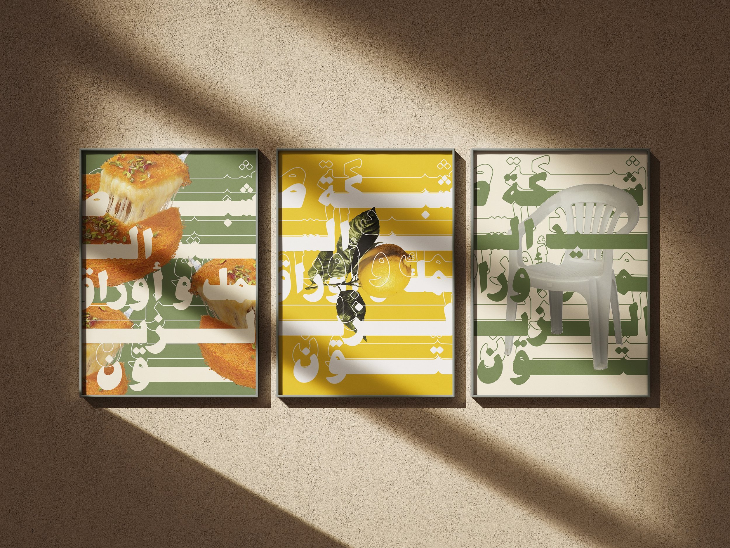
arabic is artistic expression
While this project involved minimal graphic elements, I had the pleasure of collaborating with photographer Baraa Abutaqia. Directed by myself, the project was commissioned by The First, a hair salon, for their marketing campaign. The objective was to ensure their logo stood out prominently among their range of services.
Action for palestine
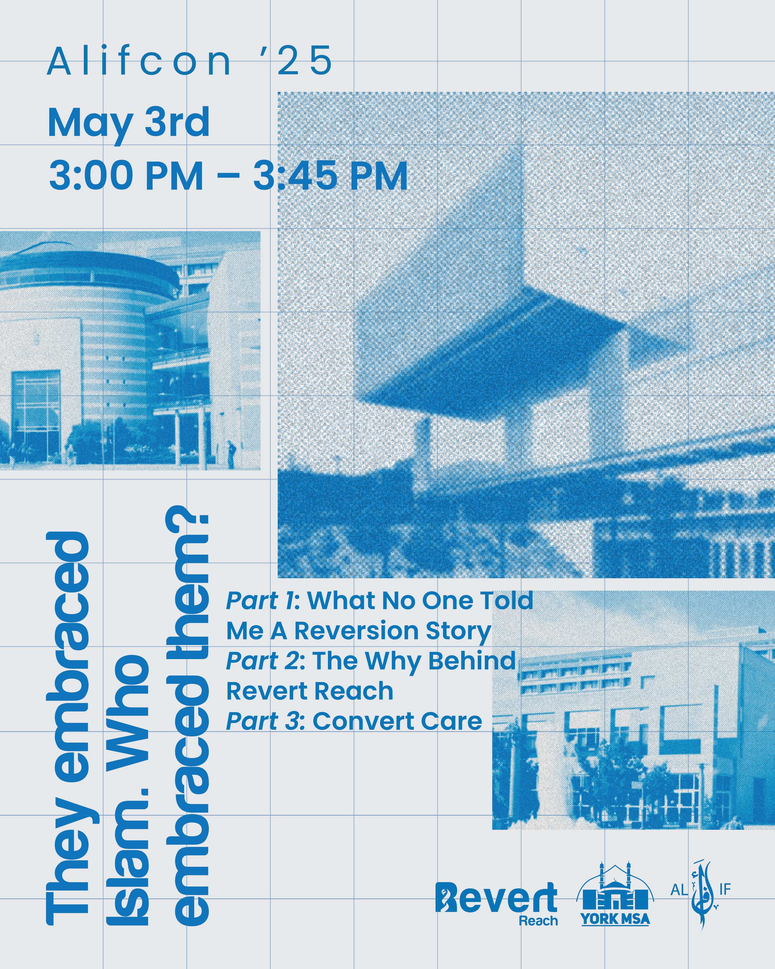
This poster was designed for an event featuring two guest speakers coming to Toronto. The objective was to create a modern, easily digestible design that conveys important event details at a glance which was the goal.
Canadians for Palestine was a logo project I collaborated on with Action for Palestine. The concept aimed to symbolize both Canadian and Palestinian identities. By incorporating the maple leaf, a Canadian symbol, along with the map of Palestine—a map familiar to the audience due to its significance—I merged the two elements to create a unified representation.
Bibi
shereen
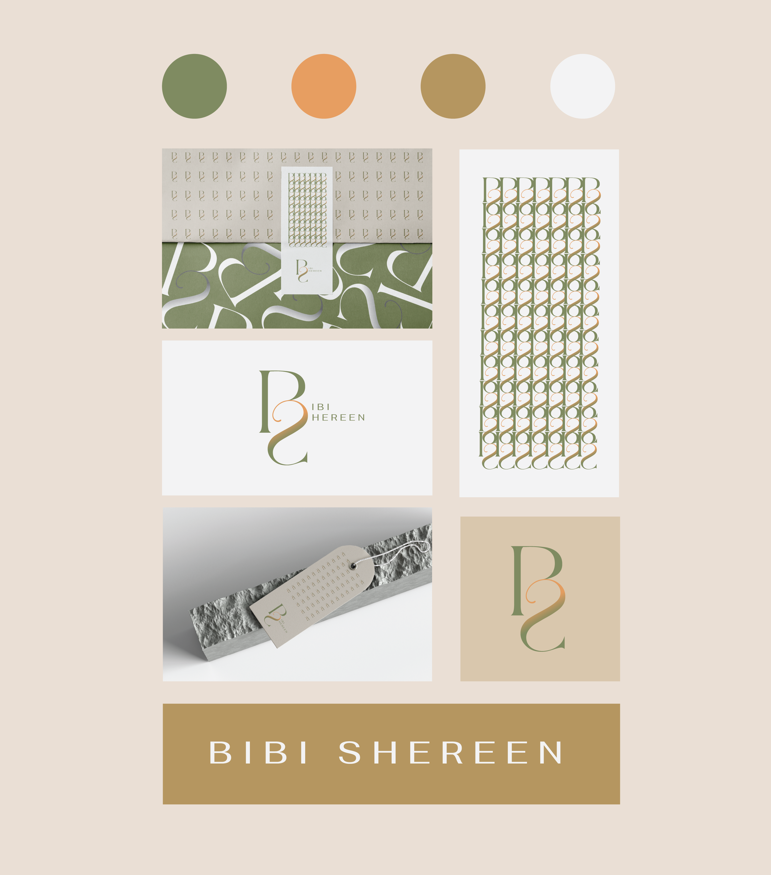
Bibi Shereen is a small embroidery business that honors the owner's mother. The brand subtly evokes a floral theme through the use of organic forms, flowing lines, and a palette inspired by natural floral hues, avoiding direct flower imagery to maintain simplicity. The essence of the brand is embodied through its soft, organic typography. The intertwined letters "B" and "S" in a soft green and peach gradient not only reflect the brand’s focus on embroidery but also hint at its floral inspiration without overt imagery. The color palette is chosen for its warm, natural feel, reminiscent of blooming flowers, enhancing the logo’s modern and impactful appearance. This design perfectly represents the brand's dedication to honoring personal heritage while maintaining a clean and contemporary aesthetic.


